This article is all about logo design and what makes it so powerful. Your logo is likely to be one of the first things your potential clients, and potential referral partners see. Your logo has the opportunity to make a lasting first impression of you, your company, and your mission. A good logo can tell a story. Your logo should be able to create a feeling, an emotional stimulation, give the viewer an idea of what your business is all about. Let’s take a look at some stellar examples of logo design done right.
Baskin-Robbins
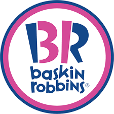
They’re famously iconic for always offering 31 unique flavors of ice cream. Their logo design includes the “31” in the “B” and the “R”, adding to the branding on the idea that made them so successful as the top ice cream franchise in the country. Their consistent 31 flavors expand to 7,3000 shops in nearly 50 countries. Not bad for a small novelty dessert shop started in 1945 by two friends, who managed to create over 1,000 unique flavors of ice cream. 31 are only ever offered at one time.
Sony Vaio
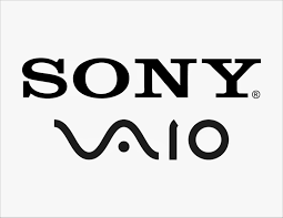
Sony Corporation is a Japanese conglomerate who’s been one of the world’s leaders in consumer & professional electronics, gaming, entertainment, and financial services. They have created trendy, innovative, high-quality products through both the analog age and the digital age. Their logo design for their Vaio line brands just that. The “VA” is symbolic of the analog wave technology, while the “IO” is designed to look like binary code, from the modern digital world. It is a beautiful representation of how the old technology morphed into newer tech, and how Sony has maintained its relevance and strength through it.
Amazon
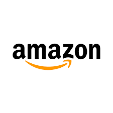 Nobody needs to be told who Amazon is and what they’re so successful for. Most people notice the arrow that appears to be a smile, or a smirk, indicating the satisfaction of being an all-inclusive mega e-commerce option for consumers. It took me a while to notice that the arrow is actually starting at the “A” and ending at the “Z”. This is the primary purpose of the logo design, indicating the massive range of products that Amazon has listed. Their goal was to be a company with everything available from A to Z and their logo reflects that branding.
Toyota
Federal Express
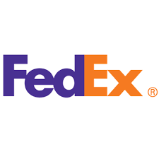 Federal Express is an industry leader in on-time logistics and carrier package shipping for consumers and professionals alike. FedEx was founded in 1971 after the founder, Fredrick W. Smith noticed how hard it was in business to coordinate air shipments in a 1-2 day period. Federal Express was created based on this branding strategy of being able to deliver from anywhere, to anywhere, in as little as a day’s time. The logo design represents this with the hidden arrow. Look and the bottom indent of the “E” and the opening of the “x” where it connects. It makes a perfect block-like arrow, facing forward. A clear message that speaks of their start, their current positioning, and their future goals.
London Symphony Orchestra
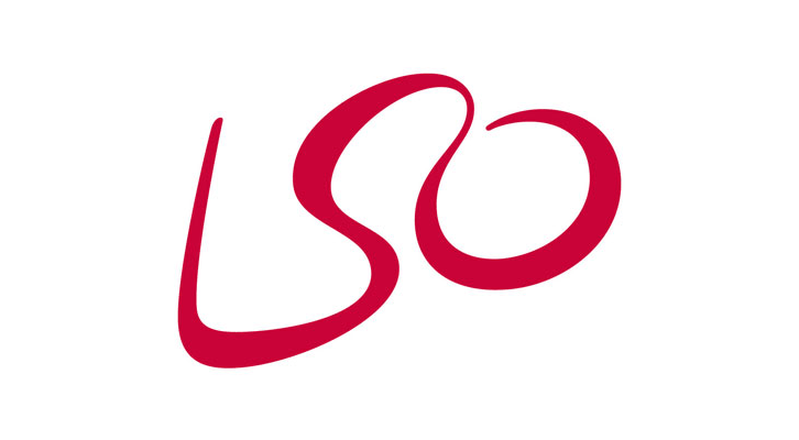 The London Symphony Orchestra was founded in 1904 and is the oldest of London’s symphony orchestras. It was set up by a group of players who left Henry Wood’s Queen’s Hall Orchestra. This lead to the LSO being so iconic. At first, it looks like a fun, memorable, and artistic way to make the initials of “LSO”. Perhaps a few broad brush strokes on canvas is what the perception is of this logo design and its meaning. If you take a closer look, slowly, you can see that it is actually a symphony conductor. The top of the “S” is his or her head, and the “L” to your left would be him or her holding the baton in their right hand. This is a purely brilliant logo. I just wished it didn’t take me so long to notice it.
Le Tour de France
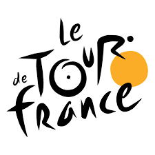 Le Tour de France. Lance Armstrong single-handedly made this event a household name. The Tour de France is an annual multiple stage bicycle race, primarily held in France, while also occasionally making passes through nearby countries. The power of the logo design here is the sheer genius of making the logo look like a bicyclist, on his bike, trekking up a hill. It’s a bit abstract so it isn’t immediately obvious as to the intent of the design, but it’s clear that this is strength in branding for the event, which is watched by roughly 3.5 billion people each year worldwide.
Logo Design

Thanks for reading!